Did you know the right interior color palette can boost your home’s value by up to 5%? Choosing a color scheme for each room in your home can seem tough. But, with the right help, it’s doable.
In our whole home color combinations story, we showed how the perfect palette can change your living areas. Here, we dive into interior design. We’ll give you a detailed guide to help you choose wisely.
Key Takeaways
- Discover the top interior color palette ideas to enhance your living spaces.
- Learn how to curate a cohesive color scheme for your home.
- Explore expert advice on selecting the perfect color combinations.
- Find inspiration for your next interior design project.
- Get tips on how to increase your property value with the right interior color palette.
Understanding the Importance of Color Combinations
Color combinations greatly affect the feel of your living space. Color is key in setting the mood in your living room. It shapes the overall vibe of your home. When picking colors, think about how they’ll work together to create a harmonious atmosphere.
The Psychology of Colors
Colors deeply influence how we see and feel our living spaces. Different colors can make us feel different emotions. For example, warm colors like red, orange, and yellow make us feel energetic and warm. On the other hand, cool colors like blue, green, and purple help us relax and feel calm.
Knowing the psychology of colors helps you choose the right colors for your home. By picking colors that match the mood you want, you can make your space feel welcoming and cozy.
How Colors Affect Space Perception
Colors not only set the mood but also change how we see a room’s size and layout. Lighter colors make rooms seem bigger, while darker colors make them feel cozier. How colors are mixed can also change how we see space.
For instance, using a lighter color on walls and a darker color on trim adds depth and dimension. But using the same color for both can make a room feel more open.
When picking trendy home paint schemes, think about the look you want. Popular choices include monochromatic schemes, complementary color combinations, and analogous color palettes.
| Color Scheme | Description | Effect |
|---|---|---|
| Monochromatic | Using different shades of the same color | Creates a cohesive, harmonious look |
| Complementary | Pairing colors opposite each other on the color wheel | Produces a bold, contrasting effect |
| Analogous | Using colors next to each other on the color wheel | Creates a smooth, natural transition between colors |
Understanding color combinations and their effect on space perception helps us create beautiful and functional living environments.
Popular Color Palettes for Interiors
Choosing the right color palette can make any room feel more inviting and stylish. There are many colors to pick from for your interior spaces.
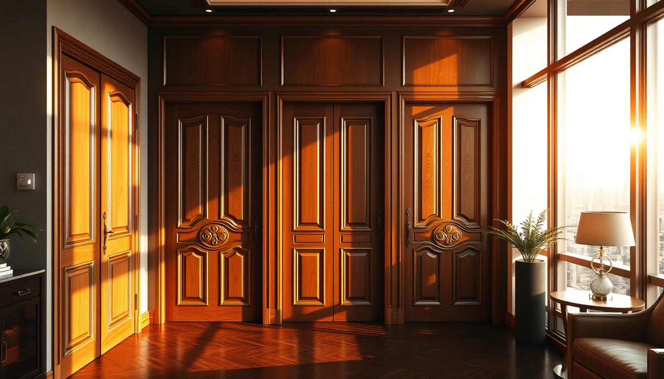
Neutral tones are a classic choice in interior design. They are versatile and never go out of style. Colors like gray, off-white, and beige create a calm atmosphere. For example, Benjamin Moore’s White Dove OC-17, Revere Pewter HC-172, and Classic Gray OC-23 are favorites among homeowners. These colors are soothing and let furniture and artwork stand out.
Neutral Tones and Their Versatility
Neutral tones work well with many decorating styles. They can be paired with bold colors for a striking contrast or used alone for a unified look. As “Neutral colors are the foundation upon which great design is built.” – a principle that holds true in many beautifully designed homes.
Neutral tones can also make a room look bigger. Lighter shades on walls and ceilings can make a room feel larger. This is great for smaller rooms.
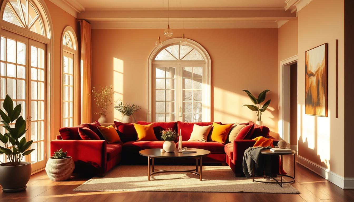
Bold Colors for a Statement Look
Bold colors can add a dramatic touch to any room. Colors like deep blues, rich reds, and vibrant yellows can make a statement. It’s important to balance bold colors with neutral tones to avoid overwhelming the space.
For a bold statement, consider using bold colors in furniture or decorative items. This way, you can add a pop of color without painting the whole wall. As the saying goes,
“A splash of color can transform a room.”
Whether you choose neutral tones or bold colors, the goal is to find a balance. This balance should reflect your personal style and make the space more functional.
Creating Harmony with Monochromatic Schemes
Monochromatic schemes are elegant and simple in interior design. They use different shades of one color. This creates a cohesive and sophisticated look that shows our personal style.
These color schemes make a space feel larger and more harmonious. They remove the visual clutter from using many colors. This brings calm and serenity to the space.
Choosing Shades of One Color
When picking a monochromatic scheme, choose a color you love. Then, vary its shades to add depth. For example, a soft white paint can be used with various textiles. This makes loftier spaces feel cozy and welcoming.
To effectively implement a monochromatic scheme:
- Start with a base color that you love.
- Experiment with different shades of that color, from lighter to darker tones.
- Use various textures to add depth and interest to your space.
Interior design experts say, “A monochromatic color scheme is not just about using different shades of one color. It’s about creating a visual journey through various textures and tones.”
“The key to a successful monochromatic design is in the nuances of the color chosen and how it’s used throughout the space.”
Textures to Enhance Monochromatic Designs
Textures are key in enhancing monochromatic designs. They add visual interest and depth. For example, combining smooth surfaces with rougher textures or mixing matte finishes with glossy ones creates a dynamic environment.
- Using throw blankets, rugs, and pillows in varying textures.
- Incorporating natural elements like wood or stone.
- Mixing different materials for furniture and decor.
By embracing monochromatic schemes and playing with textures, we can create spaces that are visually appealing. They also reflect our unique taste in top home color trends and modern interior design colors.
Using Complementary Colors in Interior Design
Interior design benefits greatly from using complementary colors. These colors are opposite each other on the color wheel. They create a striking contrast when paired together.
What Are Complementary Colors?
Complementary colors are found on the color wheel. For example, blue and orange, or red and green, are pairs. This contrast makes each color seem brighter and more intense, adding energy to a room.
Using these colors well is all about balance. Too much, and it can feel overwhelming. To balance it, use one color as the main focus and the other as an accent.
Examples of Complementary Color Combinations
A great designer trick is to pair a neutral base with bold, jewel-toned colors. Try mixing canary yellow, sapphire blue, rich ruby, and orange topaz for a lively look. Here are some successful color combinations:
| Color Combination | Description | Room Suitability |
|---|---|---|
| Blue and Orange | Creates a bold and energetic atmosphere | Living Room, Playroom |
| Red and Green | Perfect for a festive and lively ambiance | Christmas Decor, Dining Area |
| Yellow and Purple | Adds a touch of elegance and sophistication | Bedroom, Study |
To use complementary colors in your decor, start with a neutral base. Then, add pops of color with furniture, rugs, or decorations. This way, you can try out different combinations without overwhelming the space.

By understanding and applying complementary colors, you can make your home look better. You can create spaces that are visually appealing and reflect your style.
Trendy Color Combinations for 2023
Exploring the top interior color palette ideas for 2023 shows us the best wall color pairings. They balance comfort and style. This year, we’re seeing a big shift towards spaces that look good and show our personalities.
Earthy Tones for a Cozy Feel
Warm earth tones like rich cacao, sunset coral, and earthy ochre are making homes feel inviting. These colors together create a cozy atmosphere, great for living rooms and bedrooms.
To add these earthy tones to your home, try these combinations:
- Cacao and sandy beige for a soothing palette
- Earthy ochre and sunset coral for a warm, vibrant look
- Soft terracotta and moss green for a natural, earthy feel
| Color Combination | Room Suitability | Atmosphere Created |
|---|---|---|
| Cacao & Sandy Beige | Living Room, Bedroom | Soothing, Cozy |
| Earthy Ochre & Sunset Coral | Living Room, Kitchen | Warm, Vibrant |
| Soft Terracotta & Moss Green | Bedroom, Study | Natural, Earthy |
Bright Accents to Energize Spaces
Earthy tones are a solid base, but bright accents can really boost a room’s energy. Colors like sky blue, lime green, and vibrant yellow add a playful vibe to your decor.
To use bright accents well, pair them with neutral backgrounds. For example:
- Sky blue accents with a soft white or beige background
- Lime green accents against a muted gray or taupe
- Vibrant yellow accents with a crisp white or light wood tones
By mixing earthy tones with bright accents, you can make a space that’s unique and welcoming. It shows off your style and meets your needs.
Color Combinations for Different Rooms
Different rooms need unique color schemes to work well and feel right. The light in a room, its use, and the mood you want all affect color choices.

Living Room Ideas
The living room is where families and friends meet. Choose trendy home paint schemes that help everyone relax and talk. Soft colors like beige and gray make the room calm. Bold colors like navy blue or emerald green add elegance.
Some popular interior color combinations for living rooms are:
- Soft gray with creamy white accents
- Navy blue paired with warm beige
- Earthy tones like sage green and terracotta
Bedroom Palettes
Bedrooms are our own special places. They should be calming and help us sleep. Light blue, pale lavender, or muted green are great for this. They make the room peaceful, perfect for unwinding.
For a bold look, try rich jewel tones like emerald green or sapphire blue. These colors add luxury and make the bedroom cozy.
Kitchen and Dining Areas
Kitchens and dining areas are busy spots. They need colors that make you hungry and encourage talking. Warm colors like red, orange, and yellow are lively. Cool colors like blue and green are calming.
Good color combinations for these areas include:
- Crisp white with warm wood tones
- Deep red paired with neutral beige
- Soft blue with creamy white accents
Choosing the right colors for each room makes your home better. It becomes a place that feels like you, welcoming and inviting.
Balancing Warm and Cool Colors
Creating a balance between warm and cool colors is key for a stylish home. Warm colors bring comfort, while cool colors offer calm. This balance makes your space welcoming and relaxing.
The Impact of Warm Colors
Warm colors like oranges, reds, and yellows add energy. They make a room feel warm and inviting. For example, Baby Fawn OC-15 brings coziness to your living room, inspired by hygge.
Utilizing Cool Colors for Calm Spaces
Cool colors, such as blues and greens, create a peaceful vibe. They’re great for bedrooms and bathrooms. Pairing them with neutrals keeps the space balanced. For more tips, see our guide on balancing warm and cool tones.
Combining warm and cool colors creates a stylish mix. It reflects the latest home color trends. Whether you want energy or calm, knowing color impact is crucial.
Seasonal Color Combinations
As the seasons change, our homes can reflect the shift with seasonal color combinations. These refresh our living spaces. We can add a few accent pieces or even repaint the walls.
Seasonal colors not only keep our homes looking fresh. They also let us try out different styles and moods. For example, spring is a time for renewal, and our colors can show this.
Spring-Inspired Colors
Spring colors include soft pastels, fresh greens, and vibrant florals. We can add these to our decor with throw pillows, blankets, and wall art.
Some popular spring color combinations are:
- Soft peach and mint green for a calming atmosphere
- Bright coral and yellow for a vibrant feel
- Pale lavender and powder blue for a serene ambiance
Autumnal Shades for Coziness
Autumn brings warm, earthy tones that make us feel cozy. Colors like rich oranges, deep reds, and golden yellows are common in autumn.
To add autumn colors to our decor, we can use:
| Color | Decor Element | Effect |
|---|---|---|
| Warm Orange | Throw Blankets | Cozy Atmosphere |
| Deep Red | Accent Walls | Dramatic Feel |
| Golden Yellow | Curtains | Brightens Space |
By using seasonal colors, we can keep our decor fresh and exciting all year. Whether we love spring’s soft colors or autumn’s warm tones, there’s a palette for every style.
How to Test Color Combinations
Finding the right color combinations is key to a beautiful home. It’s not just about picking colors you like. It’s about making sure they work well together and enhance your space.
Before exploring interior color palette ideas, it’s important to know how colors interact. This includes how they look with your furniture and decor.
Using Paint Samples Effectively
Paint samples are a great way to test colors. Instead of painting a whole wall, start with small samples. Many stores offer peel-and-stick samples or small cans for this purpose.
- Apply paint samples to different walls to see how the color looks at different times of day and under various lighting conditions.
- Observe how the colors interact with your furniture and decor.
- Consider the color of your flooring and how it will work with your chosen wall colors.
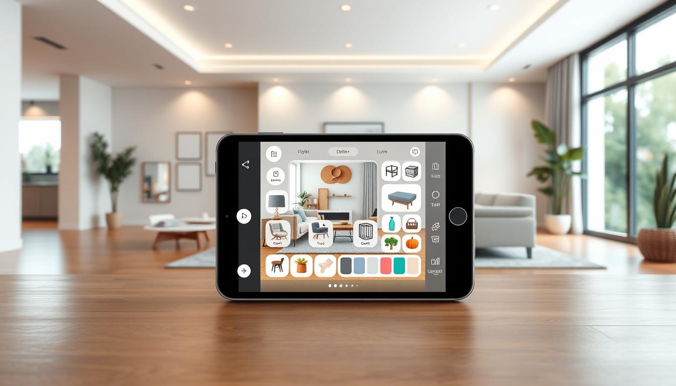
Utilizing Digital Tools for Visualization
Digital tools can also help you visualize color combinations. There are many apps and websites that let you upload a photo of your room. Then, you can “paint” it with different colors virtually.
| Tool | Description | Benefits |
|---|---|---|
| Color Planner | An app that helps you create a color palette based on a photo. | Allows for easy experimentation with different color combinations. |
| Virtual Paint | A digital tool that lets you see how different paint colors will look on your walls. | Reduces the need for physical paint samples and saves time. |
| Home Decor Apps | Apps that offer room visualization with different decor and color options. | Helps in planning the overall aesthetic of your space. |
By using both paint samples and digital tools, you can test and refine your interior color palette ideas. This way, you can create a beautiful and harmonious home.
Final Thoughts on Choosing Home Color Combinations
Choosing the right color palette for your home can seem hard. But, by thinking about what you like and how each room is used, you can make a space that shows your style. Even experts use the color wheel for ideas when picking paint for living rooms.
Balancing Style and Functionality
Finding the best wall color pairings means balancing style and use. Trendy paint schemes are a good start, but feel free to add your own twist. For more tips on picking the right colors, check out Emily Henderson’s design advice.
Creating a Unique Space
The secret to a stunning home is making it unique. Think about what you like, how rooms are used, and the latest paint trends. This way, you can create a color scheme that’s both stylish and practical.