Did you know that the colors in your living space can affect your mood and how productive you are? Selecting the right color palette is more than just a personal choice. It’s about making your space feel welcoming and balanced.
Choosing the perfect colors for your home can seem hard. That’s why we’re here to help. We’ll look at color psychology, your style, and the newest trends.
Key Takeaways
- Understand the psychology behind different colors and their impact on your mood.
- Learn how to choose a color palette that reflects your personal style.
- Discover the latest trends in home interior colors.
- Get tips on how to apply your chosen colors effectively.
- Find out how to create a harmonious and inviting space.
Understanding the Psychology of Color
Knowing how color psychology works is key to making our homes feel welcoming and comfy. Colors deeply affect our feelings and how we see things. They shape our mood, energy, and happiness.
How Colors Influence Our Mood
Different colors make us feel different ways. Warm colors like red, orange, and yellow make us feel cozy and energetic. They’re great for places where we chat and have fun, like living rooms and dining rooms.
Cool colors like blue, green, and purple calm us down. They help us relax and feel peaceful. These colors are perfect for bedrooms and bathrooms to create a calm vibe.
| Color | Emotional Response | Ideal Room |
|---|---|---|
| Red | Energy, Stimulation | Living Room, Dining Room |
| Blue | Calmness, Serenity | Bedroom, Bathroom |
| Green | Balance, Harmony | Bedroom, Living Room |
The Impact of Color on Space Perception
Colors also change how we see a room’s size. Light colors make rooms look bigger by bouncing light around. Dark colors, on the other hand, make rooms feel snug but can seem smaller.
By knowing how colors affect our mood and how we see space, we can pick the right colors for our homes. This helps us create spaces that look good and feel good too.
Identifying Your Personal Style
Finding your personal style is crucial for a home that feels like yours. Your home should show off your personality, interests, and lifestyle.
Let’s look at some popular home interior styles. These styles range from modern and sleek to traditional and cozy. Knowing these styles can help you find what you like best.
Exploring Popular Home Interior Styles
Home interior styles are varied and always changing. Some top styles include:
- Modern: Known for clean lines, little decoration, and focusing on function.
- Traditional: Features classic elements, rich colors, and detailed designs.
- Coastal: Light, airy, and often uses natural items like shells and driftwood.
- Industrial: Turns old industrial spaces into homes, with exposed brick and metal.
These styles can guide your home decor choices. You can also blend different styles to make a space that’s uniquely yours.
Combining Different Styles for Unique Results
Mixing different interior styles can make a space truly unique. For instance, you could mix modern furniture with traditional decor or add industrial touches to a coastal room.
Here are some tips for mixing styles:
- Begin with a common thread, like a color scheme or texture, to connect the styles.
- Pair bold or standout pieces with simpler items to keep the space balanced.
- Try out different layouts until you find one that feels just right.
Using popular paint colors can also help tie everything together. Pick a palette of 3-5 colors that match your style and decor.
By exploring various styles, mixing them wisely, and choosing the right colors, you can make a home that’s both stunning and truly yours.
Choosing a Color Palette
Your home’s color palette shows your personal style. Choosing colors for your home can be tough, but knowing the basics helps. It makes picking colors easier.
Monochromatic vs. Complementary Schemes
There are two main ways to pick colors: monochromatic and complementary schemes. A monochromatic scheme uses different shades of one color. It creates a smooth, elegant look.
Complementary schemes pair colors that are opposite each other on the color wheel. This adds energy and vibrancy. But, it needs careful balance to avoid too much color.
- Monochromatic schemes offer a sophisticated, streamlined look.
- Complementary schemes can add energy and vibrancy to a room.
Creating a Harmonious Color Flow
Choosing a color scheme is just the start. Making sure colors flow well in your home is key. This means picking colors that work together and move smoothly from room to room.
Use the 60-30-10 rule: 60% of a main color, 30% of a secondary color, and 10% of an accent color. This balance helps your home look cohesive.
- Start by choosing a dominant color that reflects your personal style.
- Select a secondary color that complements the dominant color.
- Use accent colors to add personality and flair to your spaces.
Think carefully about your color palette and how colors work together. This way, you can make a beautiful, harmonious home. It will show off your unique taste and style, giving you the perfect wall color inspiration for your renovation.
Deciding on a Main Color
The main color of a room sets the tone for the entire space. It’s crucial to choose wisely. Several factors play a role to ensure the color enhances the room’s ambiance and functionality.
Factors to Consider for the Main Color
Choosing the right main color involves considering the room’s purpose, the lighting, and the furniture. For example, a bedroom might benefit from calming colors like light blue or pale green. On the other hand, a home office might require more energizing colors like yellow or orange.
Room Purpose: Different rooms have different functions. The main color should reflect this. For instance, a nursery might use soft pastels, while a living room might use more vibrant tones.
Lighting: Natural and artificial lighting can significantly affect how the main color appears. It’s crucial to test the color under different lighting conditions.
Real-Life Examples of Main Color Usage
Let’s look at some real-life examples to understand how different main colors can transform a space. For instance, a modern kitchen with white as the main color can feel sleek and spacious. In contrast, a cozy living room with a warm beige as the main color can feel inviting and comfortable.
Using warm colors like red or orange can make a room feel more energetic. On the other hand, cool colors like blue or green can create a calming atmosphere. The key is to balance the main color with the room’s other elements, such as furniture and decor.
Accent Colors: The Finishing Touch
Accent colors are key in interior design, adding depth and interest. They make your space inviting and unique. We’ll look at picking the right accent colors and show examples in different rooms.
How to Select Effective Accent Colors
Choosing the right accent colors means understanding color psychology and how colors work together. Think about the mood you want in each room. For example, bold colors like red or orange can energize a room. Soft tones like lavender or blue can help you relax.
To pick good accent colors, follow these steps:
- Find the main color of the room.
- Choose the mood you want in the room.
- Pick accent colors that match or contrast with the main color.
- Try the accent colors with the main color to see if they work together.
For more ideas on modern home colors, check out Luxe Interior Co.. They have the latest trends and ideas.
Examples of Accents in Different Rooms
Accent colors can be used in many ways in different rooms. Here are a few examples:
| Room | Main Color | Accent Color | Effect |
|---|---|---|---|
| Living Room | Neutral Beige | Deep Blue | Adds sophistication and depth |
| Bedroom | Soft Gray | Blush Pink | Creates a romantic ambiance |
| Kitchen | White | Bright Yellow | Brings warmth and energy |
Designer Kelly Wearstler said, “Color is a powerful tool, and used right, it can change a space.”
“The right color can make a room feel larger, smaller, cozier, or more energized.”
By choosing accent colors wisely, you can improve your home’s look. You’ll get a look that shows off your style.
The Role of Lighting in Color Choice
It’s key to know how lighting changes how colors look in your home. The right lighting can make your colors pop or fade. This is a big part of choosing colors for your space.
Natural vs. Artificial Light Effects
The kind of light in your home changes color looks a lot. Natural light shifts with the day, affecting how colors seem. Morning and afternoon suns have different effects than the soft evening light.
Artificial lighting, like LED bulbs, can also change color looks. Sometimes, it makes colors seem brighter or duller.
A room with lots of natural light shows colors differently than one with artificial light. Think about both when picking colors for your home.

Color Samples in Different Lighting Conditions
Testing colors in various lights is key to making sure they look good all day. Apply samples to walls and see how they change with the light. This helps you pick colors that work well with your home’s lighting.
This step is vital when picking popular paint colors for your home. It helps ensure they match your lighting.
Also, thinking about lighting helps with home decor ideas. The right light can make your colors and decor look even better.
Testing Colors Before Committing
To get the right feel in your home, testing colors first is key. This step is vital in home renovation. It helps avoid expensive mistakes and ensures the best color schemes for your home.
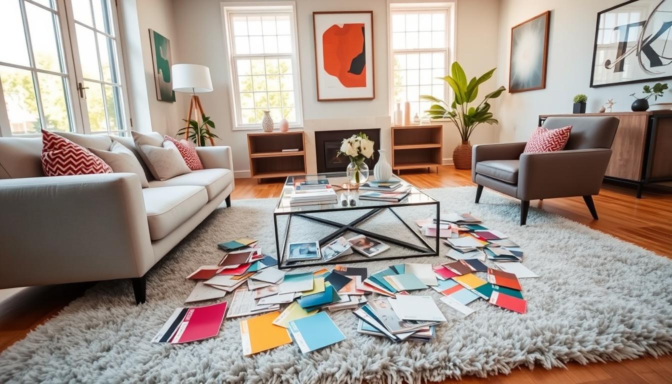
The Importance of Sample Swatches
Using sample swatches on walls is a reliable way to test colors. They show how the color looks at different times and under different lights. As interior design experts say, “A color that looks great in the store might not work on your walls.” Sample swatches give a true preview of the color in your space.
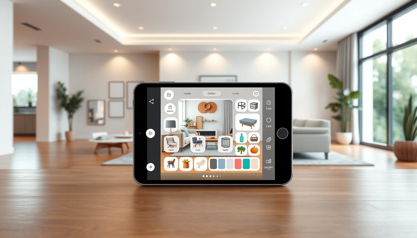
Using Virtual Tools for Visualization
Virtual tools are also great for seeing different colors. Many online platforms and apps let you upload a room photo and try out colors. This way, you can see how colors will look without painting.
As
“The right color can transform a room, but it’s essential to test it first.”
By mixing sample swatches with virtual tools, you can choose the best color for your home.
Consider the Room Functionality
The color palette you choose should match the room’s purpose. Different rooms have different uses, and their colors should help with that.
For example, some colors are great for relaxing, perfect for bedrooms. Others can increase energy and productivity, ideal for home offices.
Colors for Relaxing Spaces like Bedrooms
Bedrooms are places where we rest and get ready for the next day. Soft, calming colors like light blues, pale greens, and neutral tones create a peaceful vibe. They help us relax and sleep better.
These colors can also lower stress and anxiety. So, when picking colors for your bedroom, go for shades that feel soothing and personal to you.
Energetic Colors for Home Offices
Home offices, on the other hand, need colors that spark creativity and focus. Vibrant colors like orange, yellow, and some greens boost productivity and energy.
These colors encourage creativity and motivation. But, it’s key to mix them with neutral tones to keep the space balanced.
By picking colors that fit each room’s purpose, you make your home both beautiful and useful. This careful choice of colors can really improve your daily life.
Trends in Home Interior Colors
The world of home interior colors is always changing. In 2023, we see new trends that can make our homes look fresh. It’s key to think about how we can use these trends in a way that’s good for our planet.

Popular Color Trends of 2023
This year, deep, rich colors are back in style. They make our homes feel warm and cozy. Colors like terracotta, sienna, and umber are favorites because they remind us of nature.
Soft pastels are also coming back. They offer a calm look for bedrooms and living rooms.
Another big trend is bold accent walls in bright colors. They can really make a room stand out. Colors like emerald green, navy blue, and mustard yellow are popular for this.
How to Incorporate Trends Sustainably
It’s fun to follow the latest trends, but we should also think about sustainability. One way is to use easily changeable elements like throw pillows and blankets. This lets us update our decor without having to repaint or refurnish everything.
For a bigger impact, we can pick sustainable paint options. These paints are good for our health and the planet. Look for paints with low VOCs.
By carefully choosing the latest home interior color trends, we can make our spaces stylish and eco-friendly.
Seasonal Color Changes
Refreshing your home’s color scheme with the seasons can make it feel new and welcoming. Changing your interior colors seasonally is a fun way to update your home without big renovations. Using popular paint colors for each season can give your home a fresh look.
How to Adapt Colors Seasonally
Changing your home’s colors with the seasons means understanding color psychology in interiors. Different colors can change how your space feels. For example, spring is a time for light, bright colors that feel fresh. Winter, on the other hand, is for warmer colors that make you feel cozy.
To change your colors with the seasons, follow these steps:
- Find the main colors for each season.
- Look at your current colors and see what you can change.
- Pick popular paint colors that match the season.
- Add seasonal touches like throw pillows and blankets.
Tips for Quick Seasonal Makeovers
Quick makeovers for each season are easy with a few simple steps. Here’s how:
- Switch out throw pillows and blankets for the season’s colors.
- Add seasonal decor, like holiday items or flowers.
- Change your wall art to fit the season’s mood.
- Use color psychology in interiors to pick your colors.
By following these tips, you can keep your home feeling fresh and welcoming all year.
Maintenance and Durability of Colors
Choosing the right colors for your home is key. It’s not just about looks; it’s about how long your decor lasts. The colors you pick set the mood and keep your home looking great.
It’s important to pick good paint and take care of your colors. This keeps your home looking vibrant and beautiful. We’ll talk about picking quality paints and how to keep your colors looking good.
Selecting Paints that Last
The paint you choose affects how long your walls look good. High-quality paints last longer and stay bright. When picking paint, think about:
- Finish: Different finishes (matte, satin, gloss) offer varying levels of durability.
- Brand: Reputable brands often invest in research and development to create superior products.
- Ingredients: Look for paints with low VOC (Volatile Organic Compounds) for better indoor air quality.
For more ideas on elevating your home’s interior with painting, you can visit Luxe Interior Co. for expert advice and inspiration.
| Paint Type | Durability | Finish |
|---|---|---|
| Latex | High | Matte, Satin |
| Oil-Based | Very High | Gloss |
| Acrylic | High | Matte, Gloss |
Caring for Your Color Choices
To keep your colors looking great, regular care is needed. Here are some tips:
- Regular Cleaning: Dust and dirt can dull your walls. Clean them regularly with a soft cloth to keep them bright.
- Avoid Harsh Chemicals: Use mild cleaning products to avoid damaging the paint.
- Touch-ups: Keep some paint for touch-ups to address any marks or damages promptly.
By choosing the right paint and following these care tips, you can ensure that your home’s color scheme remains a beautiful and integral part of your living space for years to come.
Final Tips for a Cohesive Look
To make your home look great, pick colors that match in all rooms. Think about the look you want and get ideas from wall color inspiration. This will help you choose the right colors.
Consistency Throughout Your Home
Find a main color scheme that works for every room. For example, use a soothing blue in the bedroom. Then, pick a lighter blue for the living room.
Avoiding Common Color Mistakes
Don’t pick colors that don’t go together or are too close. Use sample swatches to test your colors. Also, think about the lighting in each room to get the best look.
By following these tips, you can make your home look amazing. Choosing the right colors is important for a stylish and welcoming space.