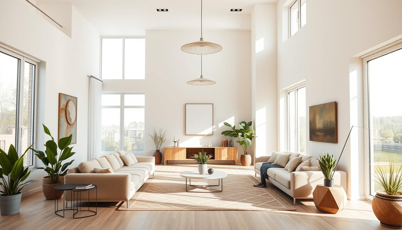
Did you know the right color palette can change your living space? Top paint makers like Sherwin-Williams and Benjamin Moore say home interior color schemes are key. They set the mood and feel of a home.
Choosing a color scheme involves many things. These include what you like, how you live, and the look you want. We’ll look at new trends and classic colors for modern home interior color palettes. This will help you make your home welcoming and in harmony.
Key Takeaways
- Understanding the 60-30-10 Rule for color ratios can help you achieve a balanced color scheme.
- Popular trim colors like Swiss Coffee OC-45 and White Dove OC-17 are timeless choices.
- Exploring different styles, such as Modern Traditional and Coastal, can inspire your color palette.
- A whole house color palette should ideally have six or seven hues.
- Benjamin Moore’s color palettes offer expert guidance for whole-house color schemes.
Understanding the Psychology of Color
Colors play a big role in how we feel at home. They can change our mood, emotions, and even our energy. Knowing how colors affect us helps us choose the right colors for our homes.
How Colors Affect Mood and Emotion
Colors can make us feel different ways. Cool colors like blue and green calm us down. They’re great for bedrooms and bathrooms. Warm colors like red and orange boost energy. They’re perfect for kitchens and dining areas.
Key emotional effects of colors include:
- Red: Stimulates energy and passion
- Blue: Promotes calmness and serenity
- Green: Represents nature and renewal
- Yellow: Enhances happiness and optimism
Color experts say knowing these effects is key to picking the right colors for our homes.
Selecting Colors Based on Room Purpose
Choosing colors for our homes depends on the room’s purpose. Bedrooms need calming colors for rest. Home offices or study areas need colors that help us focus.
“The right color can transform a space, making it more functional and enjoyable.”
Some popular home interior color combinations are:
- Monochromatic schemes for a cohesive look
- Complementary colors for a bold statement
- Analogous colors for a harmonious blend
By thinking about color psychology and room purpose, we can pick trending home interior color choices. These choices can make our homes better places to live.
Popular Color Schemes for 2023
As we enter 2023, home decor is buzzing with new color trends. These trends promise to refresh our living spaces. We’re seeing a mix of warm and cool tones that can dramatically change our homes’ feel.
Warm tones like terracotta and sienna, and cool tones like soft blues and pale greens are trending. These colors are not just pretty; they also affect our mood and feelings.
Warm Tones: Cozy and Inviting
Warm tones are back in 2023. Colors like terracotta, sienna, and golden brown make homes cozy and inviting. These earthy tones are great for living rooms and dining areas where we spend time with loved ones.
- Terracotta adds a rustic charm and warmth to any room.
- Sienna brings a sense of elegance and sophistication.
- Golden brown creates a cozy and welcoming ambiance.
To add warm tones to your decor, use them as accent walls or in furniture and accessories. This adds depth and warmth without overwhelming the senses.
Cool Tones: Calm and Refreshing
Cool tones are also popular in 2023. Soft blues, pale greens, and misty grays create calm and refreshing spaces. These colors are perfect for bedrooms and bathrooms where we relax.
“Cool tones have a calming effect on the mind and body, making them perfect for spaces where we unwind.” –
To use cool tones well, balance them with neutral shades to avoid a cold feel. Adding natural textures like wood or wicker can also warm up the space.
Understanding warm and cool tones helps you pick the best colors for your home. This way, you create spaces that are both beautiful and functional.
Monochromatic Color Schemes: Simplicity and Elegance
Monochromatic color schemes are all about elegance and simplicity. They are a favorite for modern homes. Using different shades of the same color creates a look that is both cohesive and sophisticated. This is perfect for those looking for stylish home color combinations.
Benefits of a Monochromatic Palette
A monochromatic palette has many benefits. It creates a sense of continuity and flow in the home. This style makes spaces look larger and more harmonious. It also makes choosing furniture and decor easier, as it sets a clear color framework.
Also, monochromatic color schemes are classic home interior color schemes that never fade. They bring timeless elegance to any decorating style, from modern to traditional.
Examples of Monochromatic Designs
Here are a few examples of monochromatic designs in different rooms:
- A living room with shades of blue, from pale sky blue to deep navy, feels soothing and inviting.
- A bedroom in beige or cream promotes relaxation and calmness.
- In the kitchen, white or gray shades create a clean, modern look that’s both stylish and practical.
These examples show how monochromatic color schemes can work well in different rooms. They result in a cohesive and stylish interior.
Complementary Color Schemes: Bold Combinations
Bold and beautiful, complementary color schemes pair colors opposite each other on the color wheel. This style makes bold and striking combinations that can brighten up any room.
When picking a complementary color scheme, choose colors that contrast well and fit the room’s purpose and your taste. For example, blue and orange make a vibrant atmosphere, while red and green add a festive vibe.
Choosing the Right Color Pairing
To pick the right complementary colors, start with the primary color for the room. Then, find its complementary color on the color wheel. Use the 60-30-10 rule: the primary color for 60%, the complementary for 30%, and an accent for 10%.
Here are some popular complementary color pairs for home interiors:
| Primary Color | Complementary Color | Effect |
|---|---|---|
| Blue | Orange | Vibrant and energetic |
| Red | Green | Festive and lively |
| Yellow | Purple | Bright and luxurious |
Tips for Balancing Complementary Colors
Balancing complementary colors is key to avoid visual overload. Use different shades of the complementary colors. For instance, pair a bright red with a softer green tone.
Another tip is to use the complementary color as an accent, not the main color. This creates a focal point without overwhelming the space.
By carefully selecting and balancing complementary colors, you can create a bold and beautiful home interior that shows your personality and style.
Analogous Color Schemes: Harmonious Blends
Analogous color schemes are a simple way to make your home look cohesive. They use colors next to each other on the color wheel. This creates a calm and harmonious atmosphere in any room.
Finding the Right Shades
To start an analogous color scheme, pick a main color. Then, choose colors on either side of it on the color wheel. For example, blue as the main color, with green and purple as the secondary colors. This makes the colors blend smoothly, making the space feel unified.
Think about the mood you want to create. Cool colors like blues and greens are calming. Warm colors like oranges and yellows are energizing. Try different shades to find the perfect mix for your space.
Room Ideas for Analogous Color Schemes
Analogous color schemes work in any room. For a bedroom, soft blues, purples, and pinks create a calm vibe. In a living room, warm oranges, yellows, and reds make it lively and welcoming.
- For a calming bathroom, use shades of green, blue, and teal.
- In a kitchen, warm yellows, oranges, and reds stimulate appetite and conversation.
- For a home office, cool blues, greens, and purples boost focus and productivity.
Using analogous color schemes makes your home look good and feel right. It shows off your style and makes each room better.
Trending Neutrals in Home Interiors
More and more homeowners are choosing neutral colors for their homes. These colors make a room feel calm and welcoming. They have a big impact on how a room feels.
Neutral colors do more than look good. They help make a home balanced and peaceful. The right neutral tones can make a space both relaxing and stylish.
Shades of Gray: Versatile and Timeless
Gray is a top choice for home colors. It ranges from light to dark, fitting any room perfectly. Gray is versatile and always in style.
Benefits of Gray: Gray is timeless and goes with many decorating styles. It pairs well with bold colors for a modern look or stays simple for a calm vibe.
| Shade of Gray | Best Used In | Complementary Colors |
|---|---|---|
| Light Gray | Bedrooms, Living Rooms | Pastel colors, Whites |
| Charcoal Gray | Accent Walls, Kitchens | Bold colors, Metallics |
Earthy Tones: Bringing Nature Indoors
Earnthy tones are also popular for home colors. They include beige, taupe, and sienna. These colors bring warmth and coziness to your home.
Earnthy tones work well in making a room feel cozy and inviting. They’re great for living rooms and bedrooms. Pairing them with wood and stone adds to the natural feel.
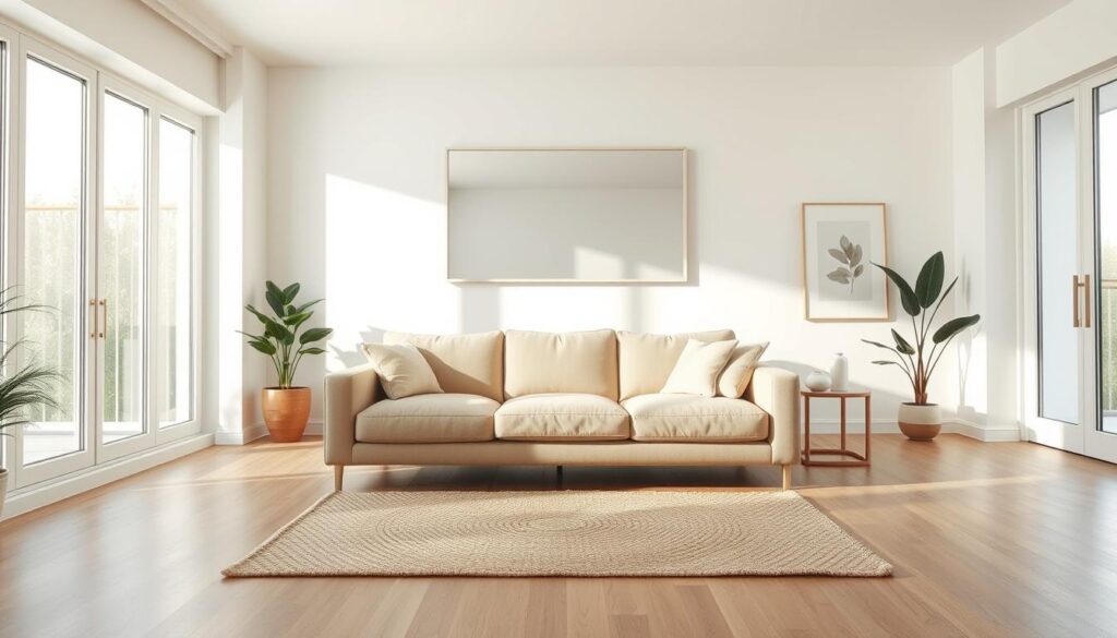
Using trending neutrals like gray and earthy tones can make your home stylish and calming. It shows off your personal style.
Choosing the Right Accent Colors
The right accent color can make your home look better. It adds personality and makes the room feel lively. This makes your home feel more welcoming and stylish.
Best Practices for Adding Accent Colors
Adding accent colors should balance with the room’s colors. Here are some tips:
- Start with a neutral base and add accent colors through furniture, rugs, and decorative items.
- Use the 60-30-10 rule: 60% dominant color, 30% secondary color, and 10% accent color.
- Consider the room’s purpose and the mood you want to create.
For example, a bedroom might need calming colors like light blue or pale green. A home office could use energizing colors like orange or yellow.
Popular Accent Color Options
Some top accent colors include:
| Accent Color | Room Type | Style |
|---|---|---|
| Deep Blues | Living Room, Bedroom | Classic, Sophisticated |
| Rich Reds | Dining Room, Living Room | Bold, Elegant |
| Bright Yellows | Kitchen, Home Office | Cheerful, Energizing |
Think about the look you want and the feelings you want to share. Choosing the right accent color can make your space feel personal and beautiful.
By using these tips and exploring colors, you can improve your home’s look. Your home will show off your style.
Color Schemes for Small Spaces
In small spaces, picking the right colors is key. It helps make the space look bigger or highlights certain areas. We’ll see how different colors can turn small rooms into cozy and useful places.
Expanding Space with Light Colors
Light colors are a classic way to make small spaces look bigger. They reflect light, making walls, ceilings, and floors seem more open. Soft whites, creams, and pale grays are great for this.
Here are some tips to make light colors work best:
- Stick to a single light color to keep things consistent.
- Avoid bold patterns and bright colors that can make the space feel smaller.
- Make sure the lighting is good to show off the light colors’ reflective quality.
Creating Statement Pieces with Bold Colors
Light colors can make a room feel bigger, but bold colors can add personality. Deep blues, rich reds, and vibrant yellows can make small spaces stand out.
Here’s how to use bold colors well:
- Accent walls: Paint one wall in a bold color to draw attention.
- Decorative items: Use bold-colored furniture, rugs, or artwork to add interest.
- Balance: Make sure bold colors are balanced with neutral elements to avoid overwhelming the space.
| Color Strategy | Effect on Small Spaces | Best Used For |
|---|---|---|
| Light Colors | Makes the space appear larger | Walls, ceilings, and floors |
| Bold Colors | Creates focal points and adds character | Accent walls, decorative items |
| Monochromatic Scheme | Creates a sense of continuity and openness | Overall color scheme for a cohesive look |
By mixing light and bold colors thoughtfully, you can create a color scheme that’s both beautiful and functional. It will enhance the beauty and usefulness of small spaces.
Seasonal Color Trends for Home Interiors
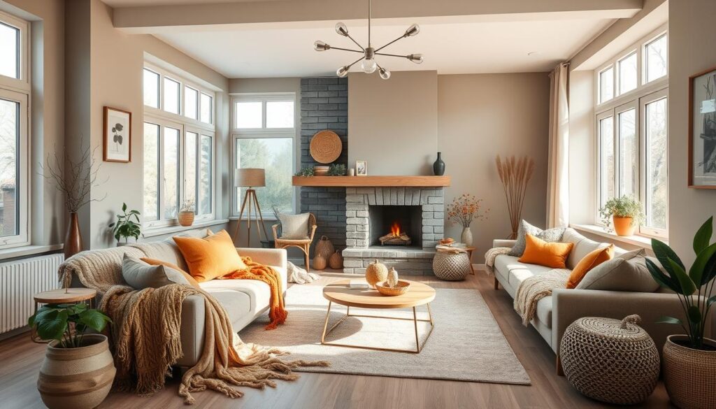
Every season brings a chance to refresh your home’s look with new colors. Seasonal colors can make your home decor feel new and exciting. You can go from soft pastels in spring to deep jewel tones in winter.
Spring and Summer Inspiration
In spring and summer, lighter colors are perfect for your home. Think soft peach, mint green, and sky blue. These colors make your home feel bright and airy.
- Soft peach and coral tones for a warm and inviting atmosphere
- Mint green and white for a cool, refreshing look
- Sky blue and sandy neutrals for a beachy vibe
Fall and Winter Color Ideas
When fall and winter come, warm colors are in. Deep reds, burnt oranges, and golden yellows are cozy. For winter, rich jewel tones like emerald green and sapphire blue add luxury.
- Deep red and burgundy for a warm, autumnal feel
- Golden yellow and olive green for a rustic, earthy look
- Emerald green and cream for a sophisticated, winter wonderland ambiance
Using these trending home interior color choices keeps your home stylish all year.
Designing with Color: Tips from Professionals
Professional designers know how to pick stunning color schemes for homes. They help homeowners make smart choices for their living spaces.
Expert Suggestions for Selecting Colors
Choosing the best color schemes for home decor is key. Experts say to think about each room’s purpose. For example, blues and greens are great for bedrooms, while bright colors can make living areas lively.
Designers also advise starting with a neutral base and adding pops of color. This makes it easy to change things up later.
Avoiding Common Color Mistakes
One big mistake is ignoring the room’s natural light. Colors look different under different lights, so test samples at various times.
Another error is forgetting about furniture and decor colors. Make sure they match the wall colors for a cohesive look.
By using these tips, homeowners can steer clear of mistakes. They’ll get a color scheme that’s both beautiful and functional.
Eco-Friendly Paint Options
Choosing the right paint is key to a healthier home. Eco-friendly options are at the forefront. They are better for our planet and our families.
Sustainable Brands to Consider
Many brands now offer eco-friendly paints. These paints are good for the environment and look great. Some top sustainable brands include:
- Farrow & Ball, known for their low-VOC paints.
- Benjamin Moore’s Natura line, offering low-odor and zero-VOC options.
- Behr’s Premium Plus ULTRA, which provides low-VOC and zero-VOC choices.
For more info on eco-friendly paints, check out This Old House’s guide on eco-friendly.
Non-Toxic Paint Choices for Healthier Homes
Choosing non-toxic paint is vital for a healthier home. Traditional paints can harm our air. But, non-toxic alternatives are now easy to find.
Look for paints labeled as low-VOC or zero-VOC. These release fewer harmful chemicals.
Non-toxic paint choices offer many benefits. They improve indoor air quality. They also reduce health risks from chemicals. Plus, they are better for our planet.
- Improved indoor air quality.
- Reduced health risks associated with chemical exposure.
- A more sustainable and environmentally friendly option.
DIY: How to Create Your Own Color Palette
Creating your own color palette is fun and creative. You can make a unique color scheme that shows your style. It also fits well with your home’s look. By looking at popular and trending colors, you can make a palette that’s both stylish and timeless.
Tools for Color Selection
To start, you need the right tools for picking colors. You can use online color picker tools or talk to a professional interior designer. Tools like color wheel charts and home decor apps help you test colors in your space.
Testing and Finalizing Your Palette
After picking colors, test them in your space. Paint samples on the walls and see how they look at different times and with different lights. This helps you choose the right colors for your home’s interior.

