As we enter 2025, a new wave of interior design trends is coming. Did you know over 70% of homeowners want to update their homes this year? They’re looking to add the latest trending paint colors and designs.
We’re excited to dive into the top interior home colors for 2025. This year, you’ll find everything from calming colors to bold statements. There’s something for everyone’s taste.
Key Takeaways
- Discover the most popular paint colors of 2025.
- Learn how to incorporate trending colors into your home.
- Explore the top interior design trends for 2025.
- Find out how to refresh your living space with the latest colors.
- Get insights into the most sought-after color palettes for the year.
Emerging Color Trends for 2025
Color trends for 2025 are all about finding harmony. They mix bold statements with soft tones. Nature’s beauty is a big influence on these choices. It’s also key to balance bold and soft colors to make a space welcoming and personal.
The Influence of Nature on Color Choices
Nature has always inspired designers and homeowners. The colors of nature, from sunrise hues to forest tones, are diverse and soothing. In 2025, we’ll see more earthy tones like sage greens and sky blues. These colors bring calm to our homes.
Bold vs. Muted Tones: Finding the Right Balance
The debate on bold vs. muted tones continues in design. Bold colors energize a room, while soft tones calm it. The trick is knowing how to mix them. For example, bold colors on walls or furniture add depth. Soft tones on bigger areas prevent the room from feeling too much.
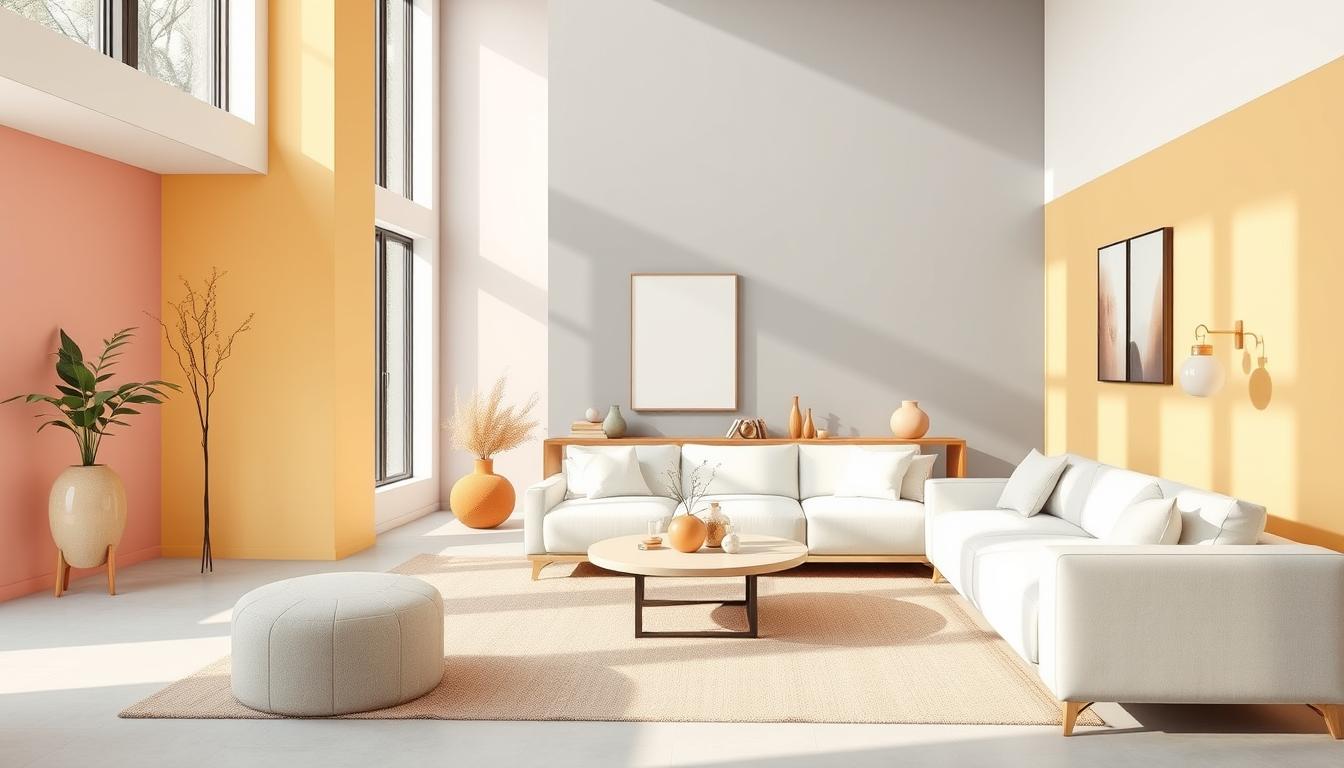
Popular Color Palettes for Every Room
Choosing the right color palette can make any room special. The latest trends focus on beauty, function, and personal style. This makes our homes truly our own.
Living Room Color Ideas
The living room is the heart of the home. It’s where we share moments with loved ones. So, picking the right colors is key. Here are some top picks for living rooms:
- Soft neutrals like beige and cream, which provide a calm backdrop for furniture and décor.
- Rich jewel tones such as emerald green and navy blue, which add depth and sophistication.
- Warm earthy tones like terracotta and sienna, which create a cozy and inviting atmosphere.
Bedroom Serenity with Soft Hues
Bedrooms are our retreats. They should be calm and soothing. Here are some color schemes for a peaceful bedroom:
- Pale lavender and soft gray, which promote relaxation and tranquility.
- Mint green and creamy white, which offer a fresh and calming ambiance.
- Dusky blues and mauves, which evoke a sense of peacefulness.
Kitchen Colors that Inspire Creativity
Kitchens are for cooking and creativity. The right colors can spark new ideas. Here are some colors to inspire your kitchen:
- Bright and cheerful colors like yellow and orange, which stimulate appetite and creativity.
- Cool blues and greens, which can make the kitchen feel fresh and modern.
- Bold reds and blacks, which add a dramatic touch and sophistication.
In conclusion, choosing colors for each room is a personal journey. It’s about the room’s purpose and our taste. By picking the right colors, we can make our homes beautiful and functional.
How to Choose Colors Based on Mood
The colors we pick for our homes can really affect how we feel. It’s key to think about the mood we want in each room when picking colors.
Warm Colors for a Cozy Atmosphere
Warm colors like oranges, reds, and yellows make spaces feel cozy and welcoming. They spark conversation and energy, great for living rooms and dining rooms.
For example, a warm terracotta can bring warmth and comfort to a living room. A deep red can make a dining room feel dramatic and cozy.
Cool Colors for Relaxation and Focus
Cool colors like blues, greens, and purples are best for calm and focus. They help lower stress and boost concentration, perfect for bedrooms and home offices.
A soft blue can help a bedroom feel relaxing. A muted green can improve focus in a home office.
| Color Category | Mood/Atmosphere | Suitable Rooms |
|---|---|---|
| Warm Colors (Oranges, Reds, Yellows) | Cozy, Inviting, Energetic | Living Rooms, Dining Rooms |
| Cool Colors (Blues, Greens, Purples) | Relaxing, Calming, Focused | Bedrooms, Home Offices |
Knowing how colors affect our mood helps us choose better for our homes. This way, we can make our living spaces more enjoyable.
Incorporating Accent Colors Effectively
Accent colors are key in 2025’s interior design trends. They add a unique touch to any room, making it welcoming and personal.

The Power of Accent Walls
Accent walls are a powerful way to use accent colors. They can be a bold color that grabs your attention. For example, navy blue or emerald green can make a room feel more luxurious.
Think about what look you want for your accent wall. Check out Luxe Interior Co. for ideas and tips on choosing the right paint colors.
Accessorizing with Colorful Décor
Colorful items like throw pillows and vases can also brighten up a room. They add a splash of color that matches or contrasts with the room’s main theme. For instance, colorful throw pillows can make a neutral sofa pop.
It’s important to balance bold colors with restraint. Too many colors can make a room feel busy, while too few can make it dull. Aim for a mix that shows off your style and fits your home’s design.
By using accent colors in walls and décor, you can make your space lively and personal. It’s a great way to show off your style and make your home stand out.
Paint Finishes and Their Impact on Color
The sheen of the paint can change how a color looks in our homes. When picking a paint color, think about the finish too. It’s not just about the color; the finish matters a lot.
Understanding Matte vs. Glossy Finishes
Matte finishes are flat and hide wall imperfections well. They’re great for quiet areas and add a classy look. Glossy finishes, being reflective, make colors pop but show wall flaws.
Choosing between matte and glossy depends on the trending paint colors and how you want them to look. A bold, glossy finish can make a color stand out. A matte finish gives a softer, more subtle look.
The Role of Sheen in Room Perception
The paint sheen affects how we see a room’s size and feel. High sheen makes rooms seem bigger because of the shine. Low sheen makes them feel warmer and cozier.
For color trends in homes, knowing about sheen is key. A high-gloss finish is perfect for bright colors in kitchens or living rooms. A matte finish is better for bedrooms, where you want a calm feel.
The Importance of Lighting in Color Selection
Lighting greatly affects how we see colors in our homes. It’s a crucial part of interior design. The look of a color changes under different lights, altering a room’s feel and look.
Natural Light vs. Artificial Lighting Effects
Natural light and artificial light have different effects on color perception. Natural light shows colors as they really are, with the full light spectrum. But, natural light’s intensity and color can change during the day, affecting color appearance.
Artificial lighting lets you control room lighting. Different bulbs, like LED, incandescent, and halogen, have different color temperatures. These can either match or clash with your room’s colors.
When picking colors, think about how they’ll look under natural and artificial light. Here’s how different lights can change color perception:
| Lighting Type | Color Temperature | Effect on Colors |
|---|---|---|
| Natural Light | Variable | Brings out true colors |
| LED Lighting | Cool to Warm | Can make colors appear vibrant or muted |
| Incandescent Lighting | Warm | Tends to add a yellowish hue to colors |
Knowing how different lights affect your colors helps you choose better. You can pick popular interior design colors and top color picks for interiors that look great in your home, no matter the lighting.
Seasonal Color Adjustments for 2025
As we enter 2025, our homes can show off the seasons with color changes. This keeps our spaces looking new and follows the latest trends. By changing colors with the seasons, we make our homes more lively and welcoming.
Changing our home’s colors with the seasons is fun and creative. It keeps our decor matching the outside world. Let’s see how to use each season’s traits to our advantage.
Spring and Summer Fresh Hues
Spring and summer are great for adding bright colors to our homes. Soft pastels, crisp whites, and calming blues remind us of flowers and clear skies. These colors brighten our homes and bring a sense of new beginnings.
- Pastel shades for a soft, serene ambiance
- Crisp whites to reflect light and enhance brightness
- Calming blues to bring in the tranquility of the sky and sea
To add excitement, use bold colors in small ways. This keeps your decor lively and up-to-date with trends.
Autumn and Winter Warmth
When autumn and winter come, we switch to warmer colors. Rich reds, deep oranges, and warm yellows make our homes cozy. These colors remind us of fall leaves and firesides, making our homes feel snug.
- Rich reds and burgundies for a luxurious feel
- Deep oranges to add warmth and energy
- Warm yellows to evoke the glow of candlelight
To not make the space too dark, pair these warm colors with neutral ones. This balance keeps our decor stylish and harmonious.
By changing colors with the seasons, our homes stay fresh and follow the latest trends. Whether you want to make a bold statement or just refresh your space, seasonal color changes are a smart move.
Creating a Cohesive Look Throughout Your Home
A harmonious home starts with a flowing color scheme. This scheme ties all rooms together smoothly. When each room has its own colors, it’s hard to keep things unified. But, with careful planning, you can make your home look cohesive and inviting.

Flowing Color Schemes Across Rooms
Begin by picking a core color for your whole house. This could be a neutral like beige or gray, or a bold color you adore. After choosing your core color, pick complementary colors for each room. Make sure they blend well together.
For a smooth transition between rooms, use a mid-tone color. For instance, if you’re moving from a light living room to a darker hallway, use a mid-tone for the walls of the next room. As interior design expert, Jane Smith, once said, “A well-designed home is all about creating a visual flow that guides the eye through the space.”
“The right color scheme can make your home feel more spacious, more welcoming, and more reflective of your personal style.”
Here are some tips for a cohesive look:
- Choose a core color and use it consistently throughout the house.
- Select complementary colors for each room that work well with the core color.
- Use gradual transitions between rooms to create a smooth flow.
- Consider the 60-30-10 rule: 60% of a dominant color, 30% of a secondary color, and 10% of an accent color.
By following these tips and choosing colors wisely, you can create a cohesive and harmonious home. Your home will feel welcoming and look great.
Sustainable and Eco-Friendly Paint Choices
In 2025, homeowners are focusing on the environment when picking paint. They want to be green without losing style or quality. This change is because we all want to leave a smaller ecological footprint.
Choosing sustainable paint involves several things. People look for brands with lots of colors and green practices. Let’s look at some of these brands and what they offer.
Brands Committed to Green Practices
Many paint makers are going green. Companies like Benjamin Moore, Sherwin-Williams, and Behr now offer low-VOC or zero-VOC paints. These paints have fewer harsh chemicals, making them healthier for homes.
For example, Benjamin Moore’s Natura line has zero-VOC paint in many colors. Sherwin-Williams’ ProMar 200 line is also low-VOC and popular with those who care about the environment.
Benefits of Low-VOC Paints
Low-VOC paints are good for the air inside your home. They help avoid health problems from bad air. They also last long, making them a smart choice for your home.
These paints also make your home look great. You can pick from many colors, from bright to soft. This way, you can update your home while staying eco-friendly.
As we move towards living greener, eco-friendly paints will play a big role. By picking the right paint, you can help the planet. You’ll also get to enjoy trending paint colors and color trends for homes that are beautiful.
Personalizing Your Space with Custom Colors
Custom colors let you make your home truly yours. They add a personal touch that popular colors can’t match. This makes your space unique and special.
Working with a color consultant is key to success. They guide you through the many color options. They help you pick colors that fit your style and needs perfectly.
Working with Color Consultants
A color consultant knows how colors work with your home’s design. They can:
- Find colors that match your taste
- Choose colors that go well with your home’s look
- Make a color plan that ties everything together
With their help, you can create a color scheme that shows off your personality. It will also make your home look better.
Using Color to Reflect Our Style
Colors can show who we are. Whether you like bold colors or softer pastel shades, your choices tell a story.
For example, bold colors show energy and excitement. Soft colors show calm and peace.
To use color to show your style, start with colors you love. Then, play with different shades and tones. Don’t be shy about mixing colors for a unique look.
Choosing colors that speak to you makes your home beautiful and personal. It shows who you are in every corner.
Color Trends in Home Decor Beyond Paint
Color is key in modern home decor. It goes beyond just paint. Textiles, patterns, and furniture also shape our spaces.
Textiles and Patterns that Complement Our Colors
Choosing the right colors means picking the right textiles and patterns too. Soft pastels from Sherwin-Williams work well with detailed rugs and upholstery. This mix creates a balanced look that shows off our style.
Furniture Choices that Align with Color Themes
Furniture is essential for a room’s color scheme. Pick pieces that match your color theme. A bold sofa or a neutral armchair can make a room pop. This approach makes our space feel both stylish and personal.