Did you know the right color palette can change your living space? Finding the perfect home decor colors can be tough. But with our help, you’ll get a look that’s both cohesive and stylish.
At Luxe Interior Co, we know picking the right color combinations for your interior design is key. Our team has picked the best colors for your next decor project.
Our guide will teach you how to choose the best colors for your home’s ambiance. We’ll dive into color psychology and share timeless color combinations to make your space unique.
Key Takeaways
- Discover the psychology behind different colors and their impact on your mood
- Explore popular interior design color palettes for inspiration
- Learn how to choose the perfect colors for your home decor
- Get expert tips on creating a cohesive look with color combinations
- Find out how to make your space truly special with our top picks
Understanding the Psychology of Color
Knowing the psychology of colors is key to picking the right colors for your home. Colors deeply affect our feelings and the mood of a room. So, choosing colors is a big part of interior design.
How Colors Influence Our Emotions
Different colors can make us feel different ways. For example, warm colors like red and orange make us feel energetic. On the other hand, cool colors like blue and green help us relax.
When picking colors for your home, think about the mood you want in each room. For instance, a bedroom might need cool colors for better sleep. A living room could use warm colors to make it more social.
Choosing Colors for Different Spaces
The purpose of each room should guide your color choices. Busy areas like kitchens need energizing colors that can handle the activity. Quiet spaces, like bathrooms, do well with calming colors that help us relax.
- Kitchens and dining areas benefit from warm colors like orange and red to boost appetite and conversation.
- Bedrooms and bathrooms are better with cool colors like blue and green for relaxation.
- Home offices and study areas should have neutral colors like beige and gray to help focus and be productive.
Color and Space Perception
Colors also change how we see a room’s size. Light colors make rooms look bigger by reflecting light. Dark colors make rooms feel cozy by absorbing light. This trick can make a room seem larger or more intimate.
By knowing how colors affect our feelings and how we see space, we can choose colors wisely. Whether you want a lively atmosphere or a calm space, the right colors can make a big difference.
Popular Color Trends for 2023
In 2023, home color trends focus on cozy, inviting spaces with a bold statement. We’re excited to dive into the top color trends for home decor this year.
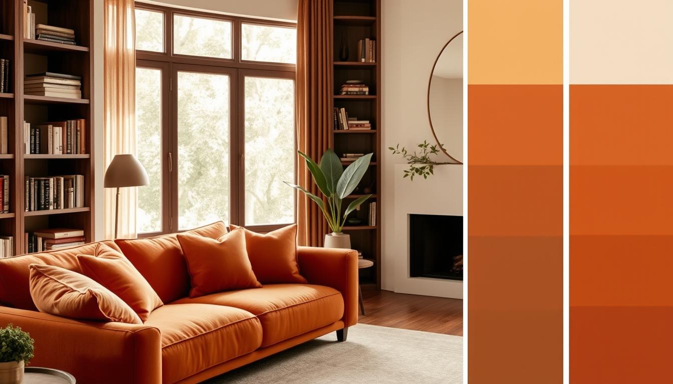
Warm Earth Tones
Warm earth tones are back in 2023, bringing comfort and coziness. Shades like terracotta, sienna, and umber create a welcoming vibe in any room.
- Terracotta: Adds a warm, earthy feel to spaces.
- Sienna: Provides a rich, natural hue that works well with both modern and traditional decor.
- Umber: Offers a deep, earthy tone that’s ideal for creating a cozy ambiance.
Bold Jewel Tones
Bold jewel tones add luxury to homes. Emerald green, sapphire blue, and ruby red bring depth and sophistication to any room.
Key Benefits:
- Creates a dramatic, luxurious atmosphere.
- Can be used as accent colors to add depth.
- Works well with metallic accents like gold and silver.
Soft Pastels
Soft pastel colors are gaining popularity in 2023. These soft hues add a whimsical touch to any room, ideal for nurseries, bedrooms, and living areas.
Some popular soft pastel shades include:
- Soft pink: Adds a touch of femininity and warmth.
- Pale blue: Creates a calming, serene atmosphere.
- Mint green: Offers a fresh, cool vibe that’s perfect for spring.
By using these color trends, you can make your home stylish and personal. Whether you choose warm earth tones, bold jewel tones, or soft pastels, have fun and experiment. This way, you’ll achieve a professional finish in your home.
Timeless Neutral Color Combinations
Neutral colors are perfect for a sophisticated look. They let your furniture and decor shine. Mixing different shades and textures adds depth and interest.
Elegant Monochromes
Monochromatic schemes use different shades of one color. They work great with neutrals for a calm, sophisticated feel. For example, a beige or gray palette can make a room feel serene.
To get this look, follow the 60-30-10 rule. Use the main color for 60%, a secondary for 30%, and an accent for 10%. This balance makes the space look good and feel right.
Layering Textures in Neutral Shades
Adding different textures makes a room more interesting. Mixing smooth and rough textures creates a nice contrast. For instance, a leather sofa, a woven rug, and a marble coffee table can make a living room pop.
It’s all about balance when layering textures. Start with a main texture, like a neutral sofa. Then, add contrasts with throw pillows, blankets, and rugs. This makes the space warm and inviting.
Using timeless neutral colors and techniques like monochromes and texture layering makes your space sophisticated and lasting.
Vibrant Color Palettes for Living Rooms
Living rooms are the heart of our homes. Vibrant color palettes can make them lively and inviting. A well-chosen color scheme turns this space into a place where family and friends love to gather.
When picking a vibrant color palette, think about how colors work together. Combining bright colors well is crucial for a harmonious and lively atmosphere. For example, mixing bold colors like emerald green and coral red with neutral shades adds depth and interest.
Combining Bright Hues
To mix bright hues, start with a main color and choose colors that go well with it. For instance, a bright blue can be paired with yellow or orange for a bold look. Or, softer blues and whites for a more subtle feel.
Try out different color combinations to find the perfect match for your living room. Don’t hesitate to explore new pairings to see what works best.
Accents and Accessories to Consider
After picking your color palette, think about accents and accessories. These elements are key to your living room’s look. Throw pillows, rugs, and wall art are great for adding your chosen colors and texture.
Adding decorative items like vases, sculptures, or unique lighting can also boost your color scheme. As an interior design expert,
“The right accessories can elevate a room from ordinary to extraordinary.”
By carefully choosing accents and accessories, you can make your vibrant color palette shine. This creates a living room that’s both stunning and practical.
Creating a Cozy Bedroom Retreat
Turning your bedroom into a cozy retreat starts with picking the right colors. A well-designed bedroom is a peaceful place to escape daily stress. The colors you pick are key in setting the mood and feel.
Soft Color Schemes for Tranquility
Soft colors are perfect for a calm bedroom. Light blues, pale greens, and neutral shades like beige or cream help you relax. These colors calm you down after a busy day.
For even more calm, try a monochromatic color scheme. Using different shades of the same color makes your room feel cohesive and soothing. For example, blues from sky to navy add depth and keep the room calm.
Accent Walls That Stand Out
Soft colors are great for calm, but an accent wall adds personality. An accent wall is a bold or contrasting color that grabs your eye.
Choose your accent wall color based on your bedroom’s colors. If it’s neutral, a bold color like red or purple stands out. If it’s already colorful, a softer shade balances it.
| Color Scheme | Description | Effect |
|---|---|---|
| Monochromatic Blues | Various shades of blue | Calming and serene |
| Neutral with Bold Accent | Neutral tones with a bold accent wall | Dramatic and personalized |
| Soft Pastels | Pale pastel colors | Soft and soothing |
By picking your colors and using accent walls wisely, you can make a cozy bedroom that’s relaxing and shows your style.
Stylish Kitchen Color Ideas
The kitchen is often seen as the heart of the home. Choosing the right paint color schemes can make it more inviting. A well-designed kitchen is not just functional; it also shows your personal style.

Classic Blue and White Combinations
Blue and white is a timeless choice for kitchens. This combo is pleasing to the eye and brings calmness. Blue brings tranquility, while white adds cleanliness. Together, they fit many kitchen styles, from traditional to modern.
To use this scheme, paint walls or cabinets blue and countertops or trim white. Adding white subway tiles or blue glass accents can enhance it. This mix works well with stainless steel and wooden furniture, making the kitchen welcoming.
The Impact of Bright Colors
Bright colors like yellow, orange, and red can energize your kitchen. They make the space lively and vibrant. These colors are great for a focal point, like an accent wall or colorful appliances.
When using bright colors, balance them with neutral tones. For example, pair a bright yellow wall with white cabinets and countertops. Adding natural textures like wood or stone can also help. They ground the space and prevent it from feeling too bold.
Choosing the right paint color schemes can make your kitchen both functional and beautiful. Whether you choose classic blue and white or bold bright colors, find a balance that shows your style. This will enhance your home’s ambiance.
Effective Use of Accent Walls
Accent walls are a great way to show off your style. They let you add color or texture that makes your home look better. An accent wall can be the room’s main attraction, making it stand out.
Tips for Choosing the Right Color
Choosing the right color for your accent wall is key. You need to know about the color wheel for interiors and how colors work together. Warm colors like reds and oranges can make a room lively. Cool colors like blues and greens can make it calm.
Think about the room’s lighting and furniture colors too. This helps ensure everything looks good together.
- Consider the 60-30-10 rule: 60% of the room should be a dominant color, 30% a secondary color, and 10% an accent color.
- Use a color that complements the existing decor to create a cohesive look.
- Don’t be afraid to experiment with different shades to find the perfect fit for your space.
Integrating Patterns for Interest
Adding patterns to your accent wall can make it even more interesting. You can use wallpaper, stencils, or textured finishes for this. Patterns can make the wall stand out and add depth.
- Geometric patterns can add a modern touch.
- Nature-inspired patterns can bring a sense of calm.
- Abstract patterns can add a unique, artistic flair.
When adding patterns, balance them with the room’s decor. This prevents the space from feeling too busy. By choosing the right pattern and color, you can make a beautiful accent wall. It will enhance your home interior color combinations and show off your style.
Outdoor and Indoor Color Coherence
Making your home’s inside and outside look like they belong together can really improve its look. This isn’t just about how it looks; it also makes your home feel more connected and easy to move around in.
To make your home look like one piece, think about how your inside colors can match your outside. This way, you can make a welcoming space that feels like home.
Extending Interior Colors to Outdoor Spaces
When you bring your inside colors outside, pick colors that can handle the weather. For example, if you have blue in your living room, choose a weather-resistant blue for your outdoor stuff.
Make sure your outdoor furniture and decor fit with your inside style. For example, if your inside is modern, pick outdoor furniture that’s simple and matches your inside materials.

Harmonizing Color Between Rooms
It’s just as important to match colors between rooms as it is to match them outside. A consistent color scheme can make your home feel bigger and more connected. Use a unifying color in every room to tie them together.
For a more detailed look, try using different shades of the same color in each room. This adds depth and interest while keeping your home looking cohesive.
| Room | Primary Color | Accent Color |
|---|---|---|
| Living Room | Soft Gray | Bold Blue |
| Kitchen | Crisp White | Warm Wood Tones |
| Bedroom | Muted Green | Soft Gold |
For more ideas on making your home beautiful and cohesive, check out Luxe Interior Co.. They have lots of info on modern home color palettes and trends.
Final Tips for Choosing Color Combinations
Choosing the right colors for your home is both an art and a science. Before making a final choice, try out samples. This can help avoid costly mistakes and find the perfect colors for your space.
Practical Experimentation
Test paint samples on your walls and see how they look at different times. This hands-on method is a top tip for getting the right feel in your home.
Inspiration from Nature and Art
Get inspired by nature and art to pick your colors. Think about the colors of a sunset or a favorite painting. By mixing these ideas, you can create a home that truly reflects your style.
## FAQ
### Q: What are the best home interior color combinations for a small room?
For small rooms, use lighter colors on walls and darker colors on accents. This creates depth. Neutral colors like whites or soft pastels make rooms look bigger. Use a color wheel to find harmonious colors.
### Q: How do I choose a paint color scheme for my living room?
Start by thinking about the room’s purpose and natural light. Choose a neutral base color and add accent colors with furniture and decor. The 60-30-10 rule helps: 60% is the main color, 30% a secondary, and 10% an accent.
### Q: What are the current popular home color trends?
Now, warm earth tones, bold jewel tones, and soft pastels are popular. These can be used in paint, furniture, and accessories. Warm tones add comfort, bold tones bring luxury, and soft pastels add whimsy.
### Q: How can I create a cohesive look in my home using color?
Choose a few core colors and use them everywhere. A unifying element, like a specific shade or texture, can tie rooms together. Think about your furniture, flooring, and decor when picking core colors.
### Q: What are some timeless neutral color combinations for interior design?
Timeless neutrals include monochromes and layering textures in neutral shades. These add depth and interest without being trendy. Beige, gray, and white are versatile and pair well with many accent colors.
### Q: How do I choose the right colors for different spaces in my home?
Consider the room’s purpose and the emotions you want to create. Calm colors like blue and green are good for bedrooms. Energetic colors like red and orange are better for living areas. Think about natural light and furniture too.
### Q: Can I use the same color palette for both indoor and outdoor spaces?
Yes, using the same colors indoors and outdoors can make your home feel bigger. Choose colors that work well in both conditions. This creates a cohesive look throughout your home.
### Q: How do I experiment with color samples before committing to a specific color?
To try out colors, paint small swatches on walls or use samples on surfaces. See how colors look at different times and with different lights. This helps you understand how the color will look in your space.